Redesign Guide Part 2
In Other Resources ・
By CinnaversePound
0 Favorites ・ 0 Comments
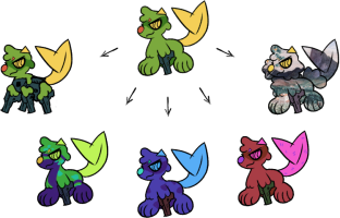
This second image shows examples of redesigns that are NOT acceptable without a redesign ticket, or in more extreme cases not acceptable at all:
- Changed theme; design strays a bit too far from the original (becomes mech - needs a ticket)
- Adding markings in contrasting / drastically different colors (may need a ticket based on how much they resemble the OG Cinna)
- Hue shifts to other colors, i.e. blue or red from the OG green (use a Magic Food Dye for this!)
- Wildly different design, does not keep original theme, shares no resemblance at all (unacceptable)
These changes may not maintain a visual resemblance to the original, but they also may. Anything more drastic than just a little touch-up goes here.
Submitted By CinnaversePound
Submitted: 1 year ago ・
Last Updated: 1 year ago
Characters
Mention This
In the rich text editor:
[thumb=1203]
In a comment:
[](https://cinnaverse.net/gallery/view/1203)
Comments
There are no comments yet.

